This wonderful write-up from @bramus is a great summary of the state-of-the-art when it comes to animating `height: auto` (and other keywords) in CSS. I had never heard of `interpolate-size`! Very cool 💯 developer.chrome.com/docs/css-ui/an…
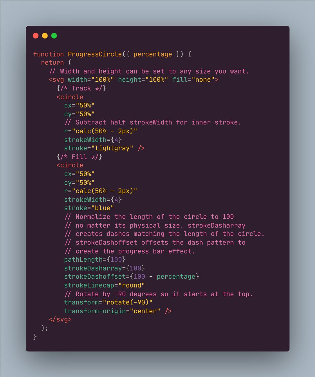
Discovered a super easy way to build circular progress bars with SVG that scale to any size! 😀 The pathLength attribute lets you normalize the length of a circle to 100. Then stroke-dasharray and stroke-dashoffset can be defined using percentages to create the progress bar. pic.x.com/nd9vwqsb3d
And you could do the whole thing without JavaScript 🤙 • Use the HTML [popover] API (nested) • CSS starting-style to transition open/close ⭐️ • Anchor positioning ⚓️ <button popovertarget="menu"></button> <div popover="auto" id="menu"></div> pic.x.com/qzwniy6onf x.com/raunofreiberg/…
Switching word combos on scroll with CSS 🖱️ main { animation: switch both steps(3); animation-timeline: view(); } @keyframes switch { to { --i: 3; }} .words__track { translate: 0 calc(var(--i) * -100%); } Result of a DM request 👇 pic.x.com/q77bl0c2sg
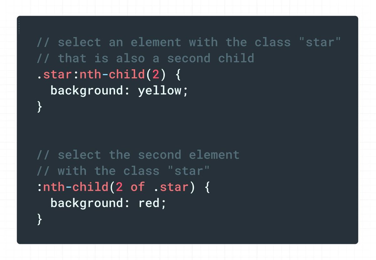
Quick CSS tip: if you want to select the nth element with a certain class, `:nth-child` supports an `of` syntax. 👏 pic.x.com/vms3srdx0d
TIL any <button> inside a form that's not a submit button you have to add <button type="button"> otherwise it's always a submit button by default x.com/i/web/status/1…
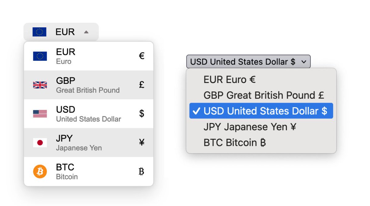
Another beautiful customized select with a usable fallback 🧑🍳😘 This API is awesome 😊 Makes my heart full to see this finally moving along in the WHATWG and browser prototypes ❤️ pic.x.com/yseagerw1t
CSS challenge: I’ve been working for a solution for leaders via SVG backgrounds with lines + stroke-dasharray: codepen.io/leaverou/pen/b… It *almost* works great except: 1. Is f*cked for long items (see 4 + source comments) 2. Needs a way to adjust the gap so that it always starts… x.com/i/web/status/1…
Day 5: Mastering CSS Animation Learnt from @KevinJPowell pic.twitter.com/oJIA7OnLT3
If you accept money anywhere online, you might be missing out if these attributes aren't in order pic.twitter.com/EAQ0ObJK5g
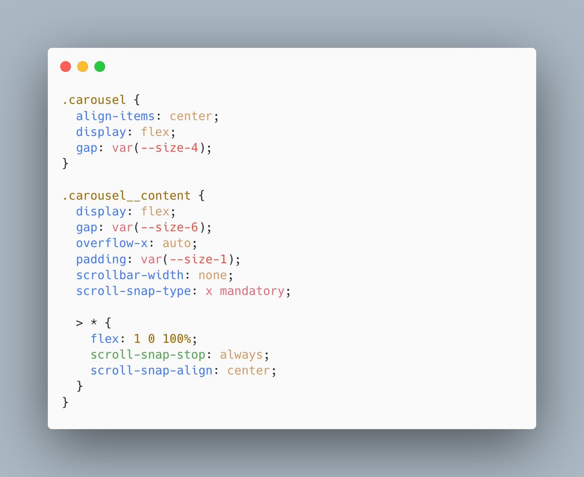
A carousel component in 20 lines of modern CSS. 😱 pic.twitter.com/EyeA5bnAVZ
Pretty impressive that you can do it without JavaScript with this new CSS API heres a quick tutorial on how to code the iPad video scroller mask effect yourself pic.twitter.com/noFimkzqtm x.com/wesbos/status/…
Is preparing buttons for proper styling a chore or do you already know `all: unset;` ? pic.twitter.com/GrEChdPzql
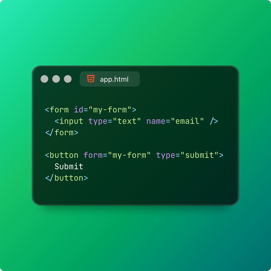
A short thread of "TIL: You can..." featuring underrated but powerful HTML/CSS tips. 🧵 💡1/5: HTML buttons can submit forms without being inside them! Use the form attribute to link a button to a form by ID. Great for flexible layouts and improved UX! x.com/i/web/status/1… pic.twitter.com/B87URFECie
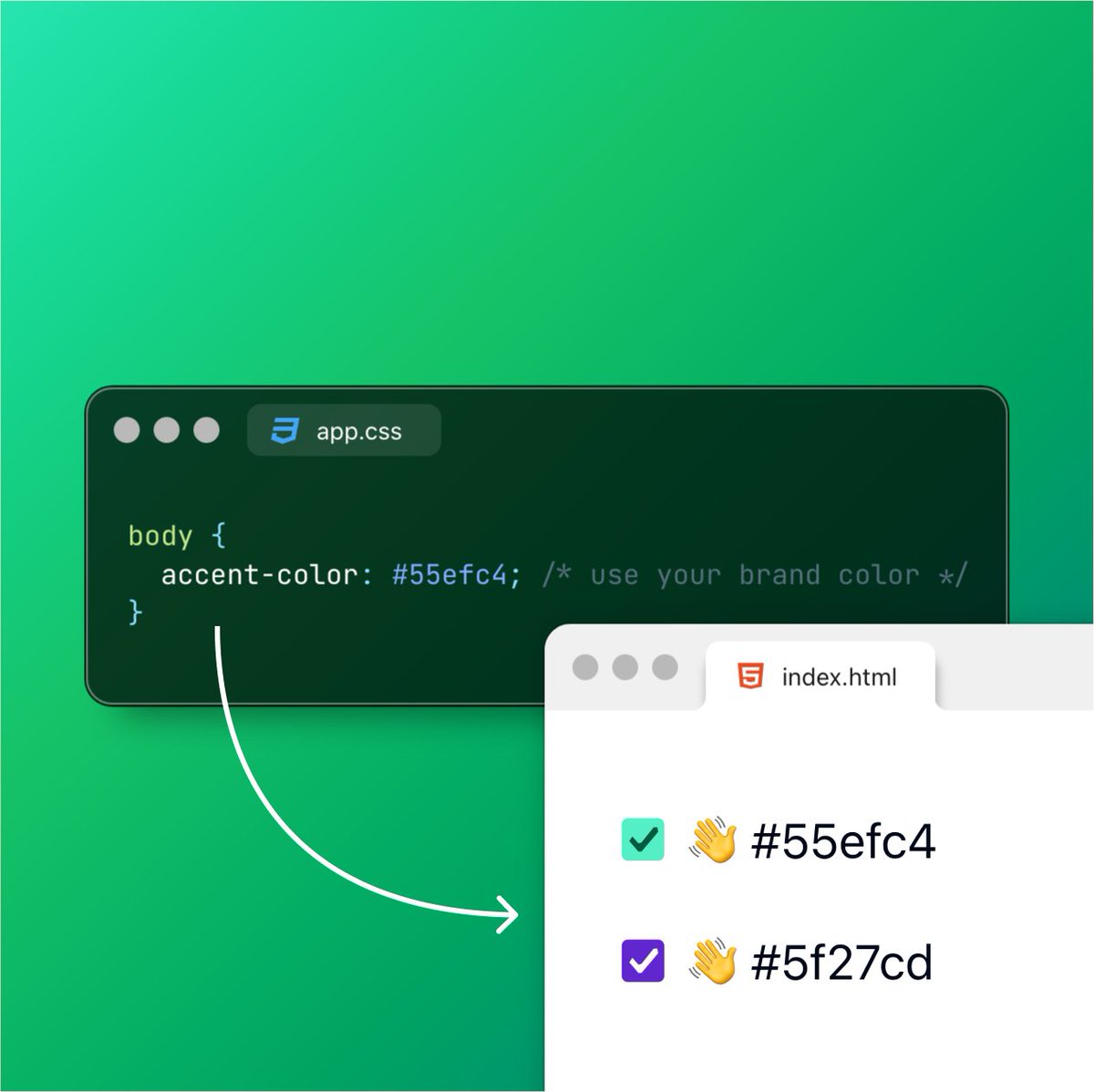
💡 TIL: You can set an accent color in CSS and it magically updates across your HTML user-interface controls! Just one line: accent-color: #55efc4 and your whole app gets a color refresh! pic.twitter.com/sFHY23nPd2
Container queries are cross-browser supported now for over a year. If you're still worried about not supporting browsers, you could adopt a fallback solution via custom elements. 🫣👇 web.dev/blog/how-to-us… pic.twitter.com/aCMJho9rzl

ZERO Javascript pic.twitter.com/xpGv3K4KnW

🔥 It feels like magic, but the <details> element will automatically expand when a search result is hidden within. It’s so hard to get this stuff right with <div>s and JS. The platform is awesome. 😄 pic.twitter.com/RZCN8hGAF0
The subtle differences when creating a squircle 🧐 Use a generated CSS clip-path to get a finer shape 🤙 .squircle { clip-path: polygon( 100.00% 50.00%, 99.95% 62.53%, 99.80% 67.70%, ... ); } Went down the rabbit hole 🐇 pic.twitter.com/OoSBRjJAcI x.com/jh3yy/status/1…
Once again I’m in the same #webcomponents crossroads I’ve been many times before. My component (an editable <color-swatch> if you need to know) has an <input>. Ideally the input should be styled like other inputs on the page and be able to participate in form submission.… x.com/i/web/status/1…
limitations of web components
Use CSS relative color syntax to darken/lighten colors for borders, backgrounds, etc. 🔥 .success { --c: green; } aside { background: oklch(from var(--c) calc(l * 0.75) c h / 0.5); color: oklch(from var(--c) calc(l * 1.5) c h); } Magic! ✨ pic.twitter.com/uKC6wTkrUo x.com/JohnPhamous/st…
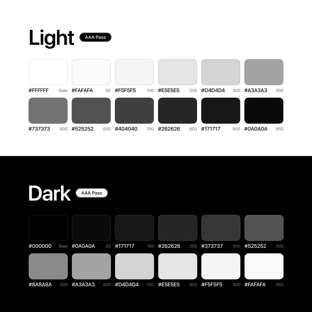
This has been my go-to monochrome palette for some time 💯 Has some great contrast between light/dark mode Bookmark for later 🤙 pic.twitter.com/ec1lWytvwh x.com/rehanxahmed/st…
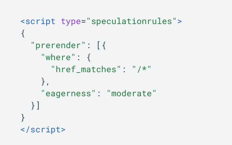
Here's a quick Friday or weekend mini-project for you: why don't you spend a few mins to add Speculation Rules to your blog (or site) to quick speed it up? Simply adding this script tag to your pages will allow intra-site links to prerender as soon as you hover on them. 🧵 1/6 pic.twitter.com/FT8yAINByr
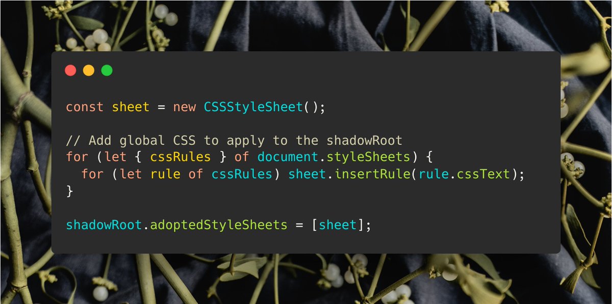
If you want to apply the global styles of the document to a shadowRoot, you can do it with this pic.twitter.com/dUSxmAyCQB
anchor-tool.com, now with a visualizer for the inset-modified containing block! pic.twitter.com/aqlMSHEn0b
With a bit of CSS, you can build a simple color picker out of a collection of radio buttons. No JS needed. Most of the time, our projects don't need a full-fledged color picker where users can craft any possible color. pic.twitter.com/FaINkg8gs5

I was fiddling around with css scroll animations a bit, but didn't know where to start... these are great examples to get started! ❤️ pic.twitter.com/ETmBqt27s1
Dune: Part Two (2024) - “That’s not hope!”📄 pic.twitter.com/pTjWBKIEN3
Need a gradient border? Use CSS background-clip 🤙 input { background: linear-gradient(canvas, canvas), linear-gradient(120deg, hsl(278, 44%, 73%), hsl(35, 81%, 73%) ); border: 4px solid transparent; background-clip: padding-box, border-box; } x.com/i/web/status/1… pic.twitter.com/zGhaobd9Mq
