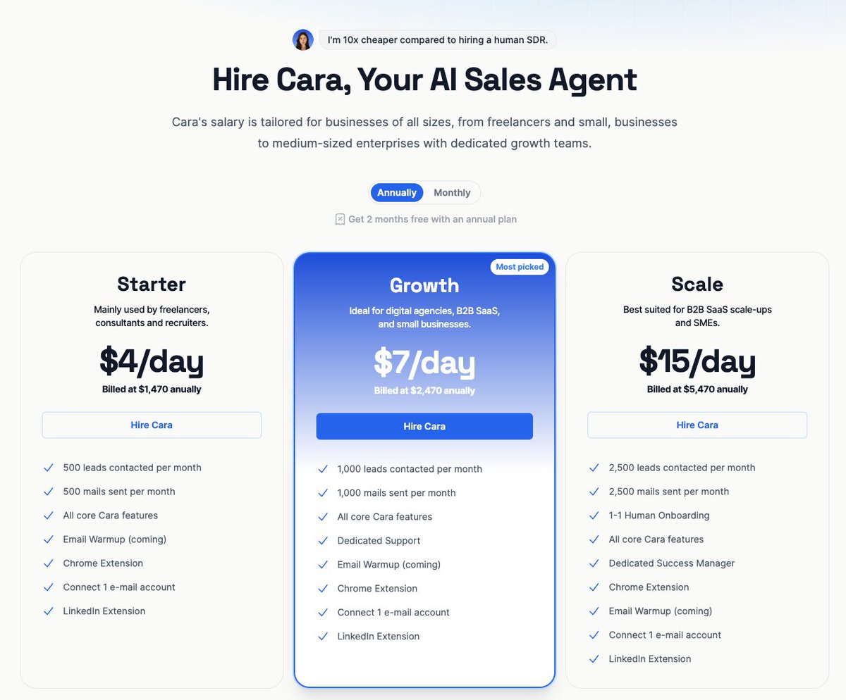
my new spot for landing page inspiration → purelanding.page pic.x.com/L4QxDDViNG
Meet the new Arrows—sales rooms + onboarding plans + client portals 💘 All in a single platform. Each purpose-built + built natively for HubSpot. But... why?? 🤝 We've always said customer onboarding should be an extension of the sales process. The best companies build tons of… x.com/i/web/status/1… pic.x.com/xhapurichz
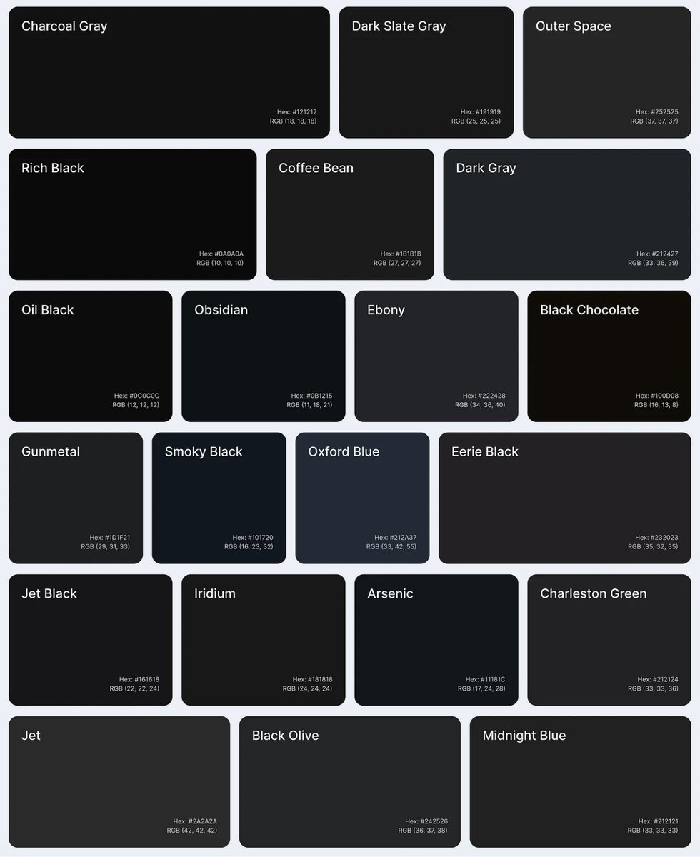
🔗 Alternatives to Using Pure Black (#000000) for Text and Backgrounds uxplanet.org/alternatives-t… #a11y #design pic.x.com/abbtexhmlg
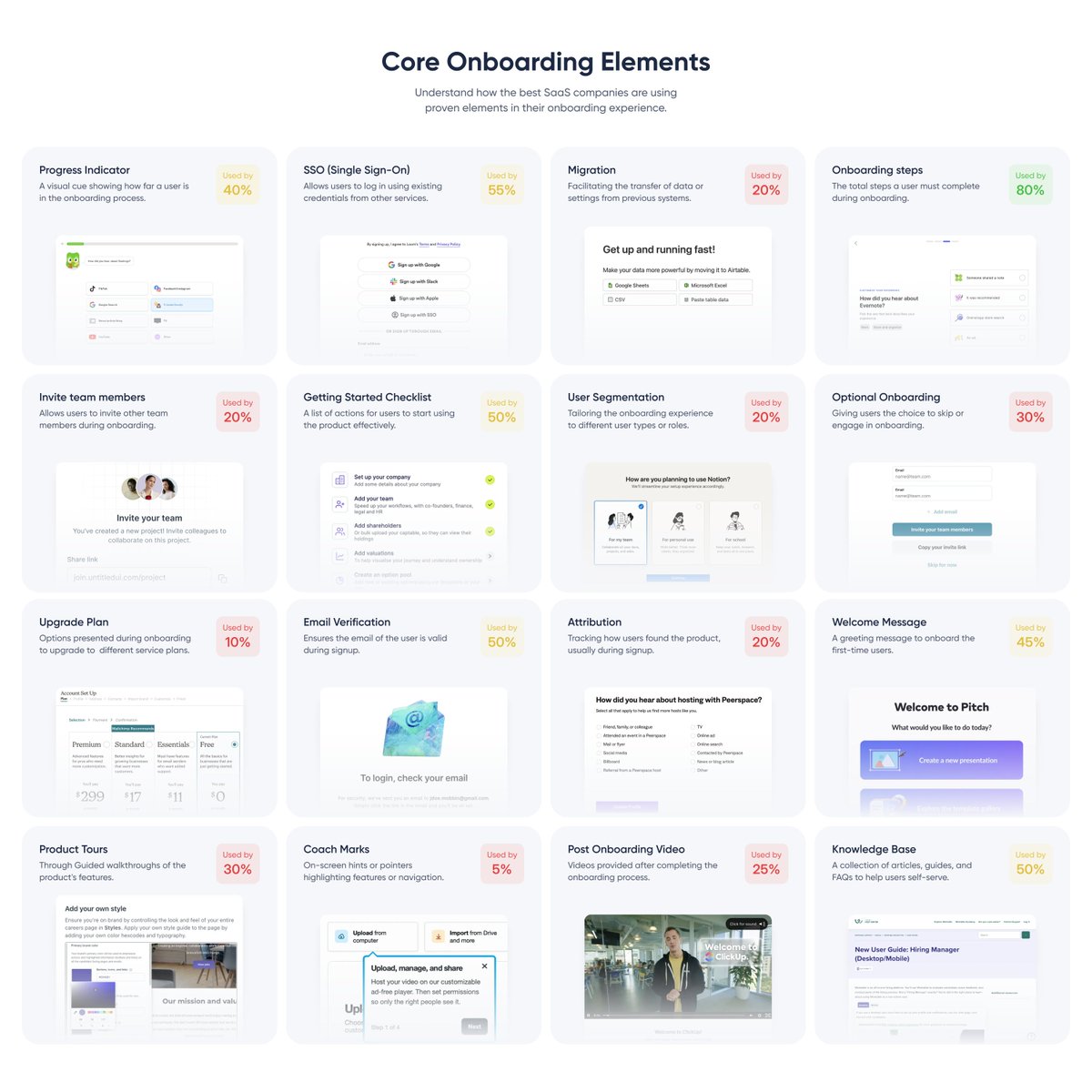
Curious how top SaaS companies master onboarding? Surprisingly, I couldn’t find a single benchmarking report. So I spent 20 hours analyzing the top 100 SaaS' onboarding flows to summarize the core onboarding elements. (bookmark for later) pic.x.com/ywop5dcsit
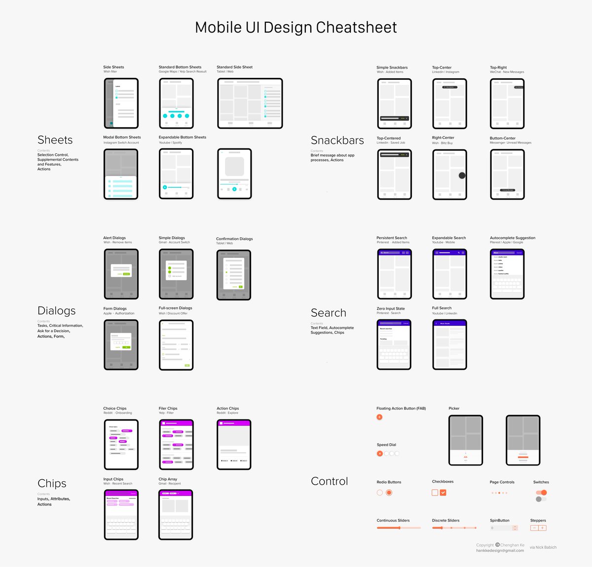
💎 Mobile UI Design Cheatsheet It covers essential UI design elements, from basic functional controls to content containers like sheets, snackbars, and dialogs. pic.x.com/btfouui7wb
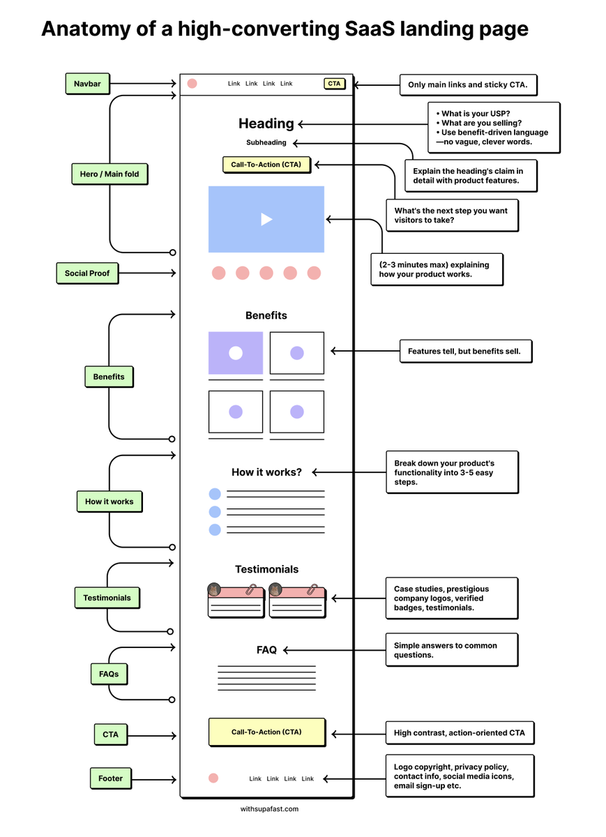
I've designed more landing pages in the past 5 months than in the last 5 years combined. Here are 9 key sections for a high-converting SaaS landing page: pic.x.com/1fooik6f0m
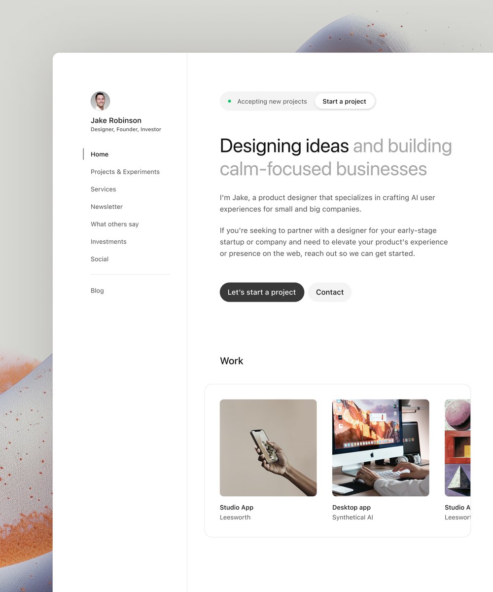
Launched my second ever @framer template! It's called Profile Hub—the perfect mini site for digital entrepreneurs wanting to showcase their projects and achievements. Get it today! 🔗 below ⬇️ pic.twitter.com/kPalXApW33
Pop pop 🫧 @bertanbakir pic.twitter.com/l0Qxpn6hXO
Have a lovely weekend 🥰 pic.twitter.com/4h2EbQf7Ka
workin on a resume pic.twitter.com/KFrBWKHCsO

UI/UX Designers, I recently found a new inspiration site for website designs. A-fresh (@afreshwebsite) is an online inspiration platform offering website designs for both desktop and mobile views, along with various design patterns. Website → a-fresh.website pic.twitter.com/QQrj1Kko3H
Conditional filters built entirely with Tremor Raw. Check demo link below 👇 pic.twitter.com/by2RSU6tkT
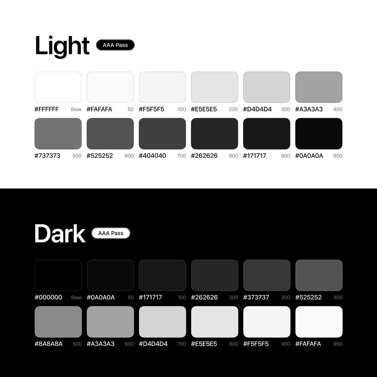
This has been my go-to monochrome palette for some time 💯 Has some great contrast between light/dark mode Bookmark for later 🤙 pic.twitter.com/ec1lWytvwh x.com/rehanxahmed/st…
Fruitful Finances Figured Out for You. → fruitful.com pic.twitter.com/hSXad0EdWq
UI/UX Designers, I recently discovered a new place for website design inspirations. Website → seesaw.website Bookmark it for later 💜 pic.twitter.com/qsHcYh2Fwq
feel the interaction, tab clickck` ⎯⟡° pic.twitter.com/jiZsUMRjJ5
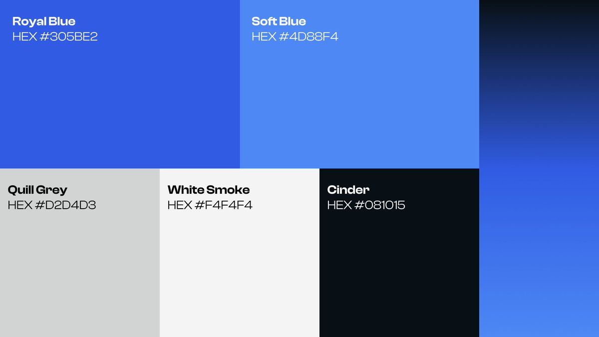
Today's color palette pic.twitter.com/NVKfTNcxI2
Navbars added this week to navbar.gallery 💫 pic.twitter.com/P9m9J5tOj2
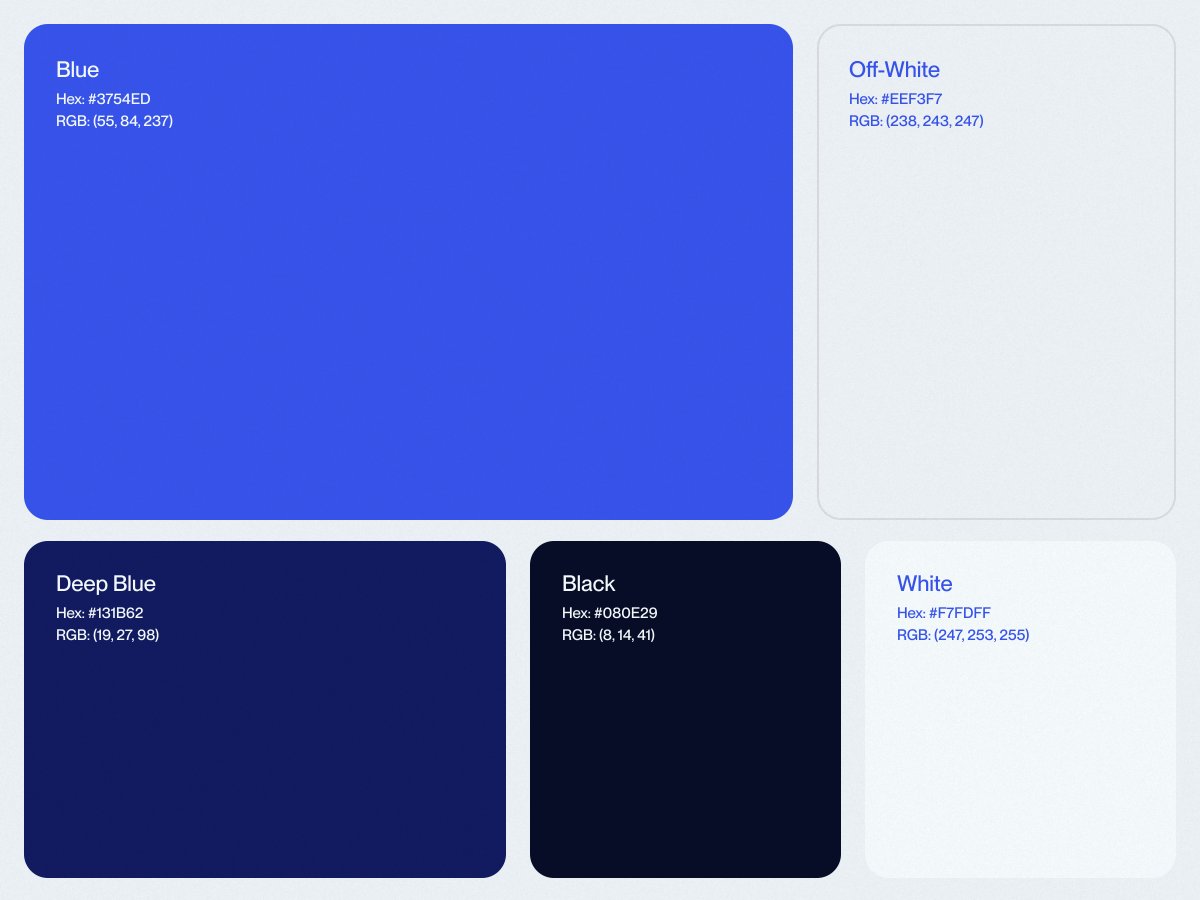
Blue color palette 🔵 pic.twitter.com/KeU8KIPEej
The newest @MobbinDesign landing page does a great job of articulating their offerings. pic.twitter.com/vyhfIJD4UF
All Free Fonts From My Profile. ↓Download Below x.com/i/web/status/1… pic.twitter.com/caIN4UuHJF
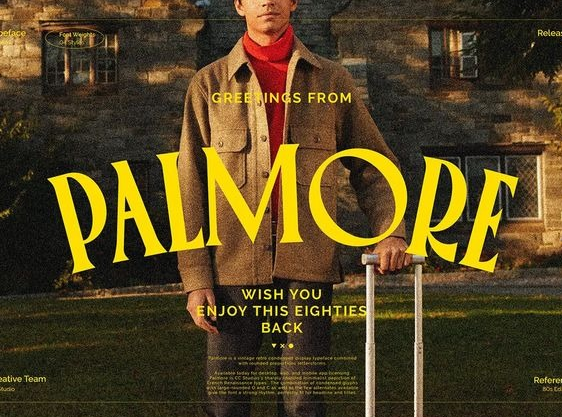
Breathtaking. From Kelvin Zero. pic.twitter.com/7PHI7bj4Dz
CSS text reveal on scroll 📜 <span style="--start: 210; --end: 280;">details</span> span { animation: reveal; animation-timeline: --section; animation-range: contain calc(var(--start) * 1px) contain calc(var(--end) * 1px); } @keyframes reveal { 0% { opacity: 0.2; }} pic.twitter.com/IAD8hkwIma x.com/jh3yy/status/1…
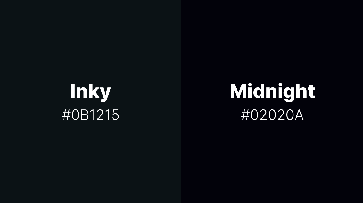
I'm torn between two shades of black. I love them both equally and can't decide which one to use. Which one do you like? pic.twitter.com/1efGfItnDY
I want to experiment with the pricing plans: Does daily price/cost sound cheap? Or does it make the value proposition stronger? pic.twitter.com/Mj1YpXCIHx
